
Call Center KPI Dashboard: Build One That Actually Triggers Action
Search 'call center kpi dashboard' in 2026 and the SERP is a wall of vendor landing pages and template galleries. None of them explain what a good threshold looks like, what happens when agents game the metrics, or how to connect a KPI breach to a real operational response. Those pages skip that part. This post covers it. Our call center services practice runs these dashboards in live revenue environments, so everything here comes from real configurations. Not slideware. The short version: a call center KPI dashboard that only reports what happened is an expensive scoreboard. The one that works has fewer metrics, hard thresholds, and a direct line to action.
Why do most call center KPI dashboards fail?
Most call center KPI dashboards fail because they display too many metrics with no action triggers. They report what happened but prescribe nothing.
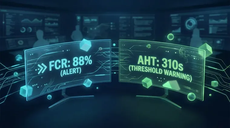
SlideTeam published a dashboard template with this note: "the numbers tell you everything and nothing." Call volume up 23%, FCR down. No causal explanation, no alert fired, no next step assigned. That's the failure mode. A call center KPI dashboard without thresholds is a rearview mirror. You see the crash after it happens.
We've seen the same pattern in every ops environment we've walked into. Managers pull up dashboards in the morning stand-up, nod at the red cells, and move on. Nothing changes because nothing is required to change. The dashboard shows the problem. It doesn't own the fix.
Five9's documentation on contact center infrastructure makes this plain: data without workflow integration produces exactly this outcome. Informed teams that still act on instinct. The goal is a dashboard that fires when a threshold breaks. Not one that waits for a manager to notice.
When agents are scored on AHT they rush calls; when scored on FCR they mark issues resolved prematurely. Dashboard design creates the incentive, good or bad.
Score agents on AHT and they'll cut calls short. Score them on FCR and they'll close tickets before the problem is gone. Your KPI dashboard isn't just a report. It's the incentive structure your agents live inside. Build it wrong and the numbers go up while service gets worse.
Which KPIs are worth tracking. And which are vanity?
FCR, after-call work time, knowledge base usage, and threshold-linked CSAT are worth tracking; raw call volume and average speed to answer alone are vanity without context.
- First Contact Resolution (with a caveat) FCR is valuable only when it's measured by post-call survey, not agent self-report. Self-reported FCR inflates the moment you tie compensation to it.
- After-Call Work Time This is the honest version of AHT. After-call work time (ACW) shows where handle-time inflation actually lives. In wrap-up, not in the call itself. Most dashboards skip it entirely.
- Knowledge Base Usage Rate An underrated metric. Low KB usage combined with low FCR tells you the training gap faster than any survey. Zoom's call center research lists it as an agent KPI but doesn't elaborate. We track it as a leading indicator of FCR decay.
- CSAT tied to a threshold, not a trend A CSAT trend line is decorative. A CSAT threshold. Say, any 15-minute window where score dips below 3.8. That fires a supervisor alert is operational. Track the threshold, not the average.
- Call volume by 15-minute interval SlideTeam's scenario research surfaces a real pattern: call volume spikes at 2:47 PM daily, dragging wait times and CSAT with it. If your dashboard reports daily totals only, that spike is invisible until the end-of-day debrief. Hours too late.
What benchmarks actually look like by center size?
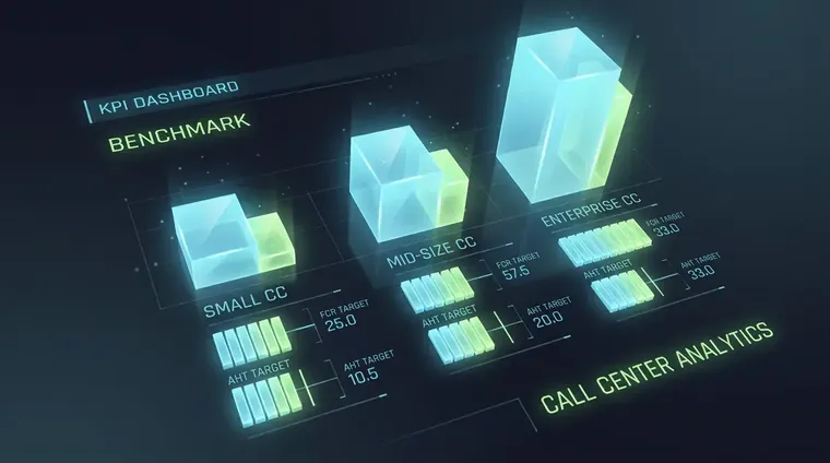
FCR benchmarks range from 70–75% for sub-50-seat centers to 80–85% for enterprise operations; AHT norms vary 4–8 minutes by industry vertical.
Every top SERP page lists FCR and AHT as core metrics. None of them say what "good" looks like. Here's what the data shows across the centers we've worked with.
For a sub-50-seat outbound center, an FCR rate of 70–75% is realistic. Enterprise inbound operations running clean CRM data can hit 80–85%. Anything above 90% on self-reported FCR is almost certainly inflated. Agents have figured out the threshold. AHT norms run 4–6 minutes for transactional calls. Billing, scheduling, simple support. And 7–9 minutes for complex resolution calls. If your AHT is under 3 minutes on complex issues, you have a quality problem dressed up as an efficiency win.
Abandonment rate benchmarks sit around 5–8% for inbound service centers. Above 10% is a staffing or routing problem. Below 2% on a high-volume line often means you're overstaffed or pushing easy calls to your best agents. Neither extreme is automatically good. The threshold you set should account for your vertical. Insurance and healthcare carry higher inherent complexity than e-commerce.
For teams building out their predictive dialer setup, lock these benchmarks before you go live. Dialer pacing decisions pile up fast when the underlying KPI targets are off.
What data pipeline powers a reliable KPI dashboard?
A reliable call center KPI dashboard requires live CRM, ACD, and WFM feeds with latency under 90 seconds. Conflicting source data is the most common reason dashboards lose manager trust.
Every vendor skips this part because it's where their product has gaps. A call center KPI dashboard is only as accurate as the data pipeline feeding it. Three source systems need to stay in sync: your ACD (automatic call distributor), your CRM, and your workforce management (WFM) platform.
Data latency is the silent killer. If your ACD reports in real time but your CRM syncs on a 5-minute batch cycle, the FCR number your dashboard shows is stale the moment a call closes. We target under 90 seconds of latency on any metric displayed in a live operations view. Above that, managers stop trusting the dashboard and revert to the ACD's own screen. Which defeats the whole point.
Integration tooling matters. Twilio Voice Programmable handles call event webhooks cleanly for custom builds. For CRM sync, HubSpot CRM documentation covers the event-based contact update model you'll need to push disposition data in near-real-time. If you're stitching platforms with middleware, Zapier's integration directory has pre-built connectors for most major ACDs. But Zapier's polling interval is 1–15 minutes depending on your plan tier. That's too slow for live ops. Use webhooks where the source platform supports them.
Conflicting numbers between source systems kill dashboard trust faster than any UX problem. ACD shows 47 calls handled. CRM shows 41. Resolve those conflicts at the pipeline layer before they hit the display layer. Our marketing automation agency team handles this integration architecture for clients who need clean data flowing into both sales and ops dashboards at the same time.
How do you wire a KPI breach to an actual operational response?
Wire each KPI breach to a specific escalation: define the threshold, assign an owner, specify the response action, and test the trigger before going live.
- 1Define the threshold, not the targetA target is what you aim for. A threshold is the floor below which something must happen. Set FCR targets at 78% but make 68% the threshold that fires an alert. Most teams only define targets. Thresholds are what give the dashboard teeth.
- 2Assign a named owner per breach typeEvery threshold has one owner. Not a team. Not a role. A person. When CSAT drops below 3.6 for two consecutive 15-minute windows, that fires to a specific supervisor's phone. Not a group Slack channel that everyone assumes someone else is watching.
- 3Specify the response, not just the alertThe alert should carry a default action: pull the last 5 calls, check ACW time, flag for QA review. Alerts without prescribed next steps add noise and burn manager attention. Write the response playbook before you launch the dashboard.
- 4Test the trigger in staging before go-liveSimulate a threshold breach in your test environment. Confirm the alert fires, routes to the right owner, and the response playbook is accessible from the notification. We've shipped dashboards where the alert logic worked but the escalation path was broken. Nobody found out until a real breach.
Cutting a call center KPI dashboard to 5 metrics per role requires more design discipline than displaying 30. The hard work is deciding what not to show.
Every vendor pushes dashboards with 20–30 metrics because volume looks thorough. We cap role-specific views at 5 KPIs. That constraint forces a real conversation: which number, if it moved 10%, changes what this person does today? That question is harder than adding another tile. It's also the only one worth answering.
Reporting dashboard vs. Action dashboard: what's the difference?
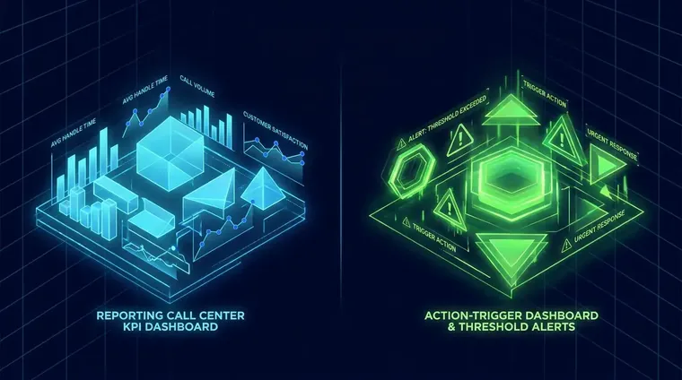
A reporting dashboard shows what happened; an action dashboard fires alerts, routes to named owners, and carries a prescribed response. The architecture is at root different.
| Feature | Reporting Dashboard | Action Dashboard |
|---|---|---|
| Primary function | Shows historical and real-time metrics | Triggers escalation when thresholds breach |
| KPI count | 15–30 metrics, often role-agnostic | 3–5 per role, mapped to decisions |
| Alert logic | Color-coded cells (red/yellow/green) | Named-owner alerts with response playbook attached |
| Data latency tolerance | 5–15 minute batch syncs acceptable | Under 90 seconds required for live ops |
| Failure mode | Dashboard fatigue — managers stop looking | Alert noise — requires threshold discipline to avoid |
What compliance considerations affect your dashboard data?
TCPA compliance rules constrain which call data you can log and display. Recording consent status must surface in the dashboard before agents see contact records.
Most dashboard guides skip the legal question entirely. What data can you actually capture and display?
TCPA compliance rules from the FCC govern how outbound call data is collected and retained. If your dashboard pulls recording data or consent status from an outbound campaign, that status needs to be visible at the record level before an agent sees a contact. Not buried in a backend log.
For outbound centers running predictive or auto-dialed campaigns, consent fields need to flow from your CRM into the agent view in real time. A contact who revoked consent three hours ago should not appear in an active dialer queue. If your dashboard is pulling from a stale CRM snapshot, that gap is a compliance exposure. Not a data quality issue. A legal one.
This is why we build the data pipeline before we design the display layer. The display problem is a UX problem. The pipeline problem is something else entirely.
Frequently Asked Questions
What is a call center KPI dashboard vs. A standard report?
A call center KPI dashboard displays live and near-real-time metrics tied to operational thresholds. Unlike a static report, it should fire alerts when those thresholds breach and route to a named owner with a prescribed response. If it only shows what happened, it's a report with a better UI, not a dashboard.
How many KPIs should a dashboard display per agent or supervisor?
We cap role-specific views at 5 KPIs. More than that and attention dilutes. Managers end up watching nothing because everything is flagged. The discipline is deciding which single number, if it moved 10% today, would change what that person does. That's the only KPI that earns a tile.
What integrations are required to build a reliable call center KPI dashboard?
At minimum you need live feeds from your ACD, CRM, and WFM platform with latency under 90 seconds for any metric in the live ops view. Webhook-based integrations (Twilio, HubSpot event API) are preferable to polling-based middleware like Zapier for real-time displays. Zapier's polling interval tops out at 1 minute on paid plans, which is marginal for live operations.
How do you stop agents from gaming call center KPI dashboard metrics?
The main lever is measurement method, not metric choice. FCR measured by post-call survey resists gaming better than agent self-report. Tracking after-call work time separately from handle time exposes where AHT inflation actually lives. And rotating which metrics trigger compensation review. Without warning. Removes the stable target agents would otherwise optimize around.
Related reading
Ready to build a dashboard that does more than report?
Our call center services team builds KPI dashboards with hard thresholds, named-owner alerts, and pipeline integrations that keep data latency under 90 seconds. If your dashboard shows the problem but nobody owns the fix, that's the gap. Book a working session and we'll map your KPI architecture on the first call.